
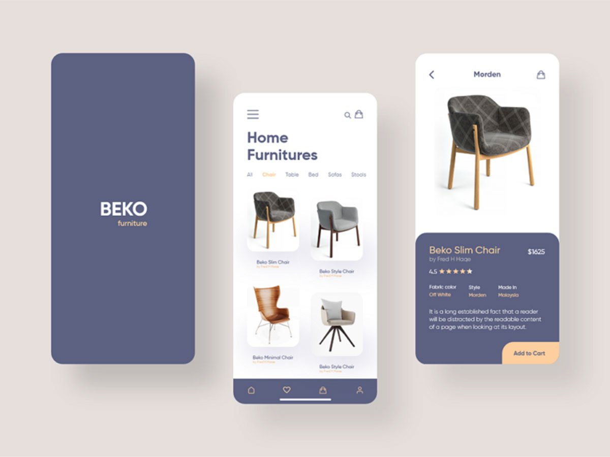
The Beko Mobile Design project was built with a strong focus on functionality, clarity, and brand alignment. Our objective was to create a mobile interface that feels natural to use while elevating the user experience through thoughtful design choices. We used a clean layout system that guides the user intuitively through each step, ensuring smooth navigation and minimal friction. From typography to spacing, every visual element was carefully structured to support readability and usability.
Consistency played a key role in the design process. We developed a cohesive visual language using a defined color palette, grid system, and reusable UI components. This not only improved the overall aesthetic appeal but also made the interface scalable and easy to maintain. Interactive elements were strategically placed to drive user engagement while keeping the interface lightweight and responsive across different screen sizes.
By adopting a mobile-first approach, we ensured that the experience feels fast, modern, and easy to use. The design prioritizes essential content, simplifies the user journey, and promotes quick access to important actions. Altogether, the Beko Mobile Design demonstrates a balance between creativity and usability — showcasing how user-centered thinking can transform mobile experiences into meaningful interactions.
Beko Mobile Design
25 - 12 - 2023
15 - 01 - 2024
Beko Solutions LLC.
United Arab Emirates